There are a lot of decisions to make in the first days of building a new application.
For B2B apps, the user experience tends to include a lot of forms and data input. When we get started it's common to reach for a pre-built library, often a popular free one. If we review the library at all, the process typically goes something like:
- Am I using a UI library (react-bootstrap) that highlights a solution (Formik)? Use that one.
- Review libraries on the internet:
- Search for my library and component name, ex: "react date"
- Scan the docs or github readme, does it look like it has the flexibility I think I need?
- Can I customize the colors?
- Are the last modified dates recent? (is it being actively supported)
- (sometimes) Is the license file one we can use?
- (sometimes) Are there a lot of open issues?
- Make a selection and start coding
This list is missing a lot of requirements, and many times I've instead ended up building our own input library to meet them.
A deeper requirements check
I've worked on business applications with free off-the-shelf components, paid libraries, and custom. This is a more extended list of questions I consider (and if you have more, I'd love to add them).
Questions before starting the search
Use these questions to create specific requirements to help selection or during prototyping.
1. What are the business data types we operate on? (Atomic types)
Text, date, number, select are generic, one size fits all, but my business is going to have a more specific set of data it talks about.
- What are the atomic types we'll be dealing with, and the characteristics important to them that we'll want the inputs to solve really, really well?
Example: For a business budget application, dealing in things like expenses, loans, percentages of ownership, etc, my atomic inputs may include:
- text, URL, integer quantity, rate percent, ownership percent, optional date, date, select, USD currency
Rate percent may always be expressed as a 3 decimal percentage and may allow entry of either percentages or basis points, Ownership may be limited to 2 decimal places or use fractions or possibly both
2. What type of testing do I intend to perform?
Unit testing
- Can I enter a value during a test and "see" it in the input somehow? Without manipulating incoming values or looking into internal state?
- Ex: Can I "type" a number into an input and exit the input and it displays a formatted version
- Can I inject an updated value through the binding or prop and see the formatted value update accordingly?
UI Testing
- Is it easy to uniquely identify and find a component during a UI Test?
- Can I validate the contents?
- Ex: Verify the dropdown shows the correct subset of car models after I select a brand
- Ex: Verify the date value displayed in the input
- Is it easy to interact with the component from a UI Test?
- Ex: Click to open the dropdown, click on an option to make a selection
- Ex: Type a date into a fancy date input
3. Architecture
Note: "back-end" in this context is your business logic, reducers, or similar that live in the front-end code behind the UI, not a server
-
What level of invalid value is allowed to flow from the input into my logic? (Values applied to a bound model or evented as an updated value)
- Invalid types: entering text for a percent input - the text is sent as an updated value to model/back-end
- Validated invalid types: entering text for a percent input -
nullor a default value is sent as an updated value to model/back-end - Invalid values: entering
120%in an "ownership" percent input (0-100%) - bad types are not sent, invalid values are sent - Simple valid values: entering
120%in an "ownership" percent input (0-100%) - this value is not sent, but80%would even if there is only10%ownership outstanding - Complex valid values: entering
80%in an "ownership" percent when only10%is outstanding - this value is not sent, only values between 0-10% would be (truly valid)
-
Does it expose the behavior I need for my architecture?
- Updates: do I expect values to flow to my back-end with every key down or only once a full value has been entered (blur)?
- Extra Event Behavior: do I need access to additional events to provide extra behavior? Ex: if I have custom validation, do I want to catch
Escapeto reset the value to prior valid value? - Validation: am I creating my own validation infrastructure/wrappers and can they manage the control value appropriately?
4. Validation
The user intends to do the right thing, but sometimes misunderstands the box, has the focus in the wrong area, mistypes, or otherwise starts to make a change they didn't intend...
-
When is validation displayed to the user (ties into prior questions)?
- Is it displayed to the user when the form is rendered, if no values are entered yet?
- Is it displayed to the user if the existing value does not match the validation rules?
- Ex: It used to be ok to enter a 50 character name, now you're restricted to 34, but the one saved a year ago that you just loaded is 50
- Is it displayed as they type, or only once they've finished entering the whole value? May be specific to the atomic types from the top
- How is validation communicated for complex, multi-input business rules? (all ownership inputs add up to 100%, for instance)
- Is there a plan to side-step some of these validation scenarios?
- Ex: having a single calculated "retained ownership" box in a list of owner percentages and binding other input's max range to their current value + the remainder, so a user cannot force the total over 100% when editing an individual box, removing the ability to invalidate the whole set in one edit
-
How is validation communicated to the user?
- Is there alternative methods of display/communication for the different cases in the prior question?
These are up front questions that require me to think more deeply about how the application will work and be validated. They should generate a more refined set of questions or points to validate.
Additional requirements to validate
Once I have the questions above, there's some more standard ones to consider as well.
1. Styling
- Can I easily re-style the component through CSS? Can I use CSS/SCSS variables, functions, mixins, or centrally defined classes?
- Ex: If I have 10 input controls, I want to use common styles or mixins and not have to custom code 10 separate solutions and try to keep them matching
- Can I easily style them to have stretch and fixed widths, to accommodate different layouts?
- If they incorporate floating containers (dropdowns, validation boxes, menus), do those floating boxes:
- Adjust if too close to the edges of the screen
- Portal, so they don't show up z-indexed below a neighboring row or section in a separate z-index stack
- Stay attached to the underlying control - I can't count the number of controls that introduce a gap on certain browsers or resizes, which is infuriating as a user when you mouse across that gap and the thing you were trying to interact with disappears
2. Accessibility
- Do the inputs meet accessibility guidelines?
- Consistently with all of the other elements of your interface?
3. Interactivity, Experience
- Does Tab and Shift+Tab do what you would expect?
- Ex: Try tabbing through calendar inputs. Most are excruciating, some break tab workflows and will force your users to alter their behavior
- Does typing into the input force any unexpected behavior or requirements on you?
- Do arrow keys do what you expect in components like dropdowns and menus? If you don't have an expectation, lean on WCAG and WAI-ARIA docs
- Across all of the inputs/libraries, how consistent will the experience be? Will the interaction be the same?
- Is the interaction consistent with your application and other inputs? Ex: Changes in visual queues like an input highlighting when focused, etc.
This is a much better start. I suspect there's a few more you could think of from your own experience, too.
Creating custom inputs
I work primarily in the B2B space, which means a lot of applications that feature data entry.
Data entry is already fraught with error, so it's important to give the user every advantage we can, including consistent behavior and clear messaging. Our users range from folks on the first day of their new career to experienced power users, who know exactly how many tabs it takes to get to every box on the screen.
Not like this: Unexpected hijack of tab focus and sudden inverse behavior if you mis-type
Off the shelf components
Off the shelf components are attractive because they support a wide set of behavior ("we might need it one day") and because they have a cheap up front cost.
This is great for rapid prototyping to test ideas with real users, not so great when the quirks of the libraries end up shaping our back-end architecture or adding an overhead to every change. Or don't fix an issue after we've built half of our application around them, forcing us to fork and then maintain a library.
...And then we use one of those 100 "we might need it one day" features and find out it had a bug too. Which we now have to patch into our fork from a change made 6 months later on the official package, which has since had 50 other bug fixes. And there goes all the cost savings just to keep an "ok" solution working.
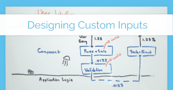
Designing Custom Inputs
I've built custom inputs for a variety of languages, most recently React and Svelte. While I don't have a one size fits all model, I do have some base principles I tend to follow each time.
Custom input requirements
- Must work with tab (+ arrows if relevant)
- Must support my atomic types (which may mean several valid input patterns, potentially with scaling or reformatting)
- Must display a formatted value and allow raw or formatted entry
- if it's a date, must have reasonable behavior that prioritizes mouse and keyboard appropriate for it's use, does not enforce a requirement on zero padded values (or the reverse), and if it has a calendar picker it does not introduce new tab stops in the general flow
- Must support scaling of values: users should be able to enter percents as
10%and the value automatically scale to0.10behind the scenes - Must update/event the raw value, not the formatted string
- if it's a date, has a consistent behavior for timezones (my preference is to use a custom type or shift all values to a UTC 00:00 time behind the screen)
- Often: Must manage the bound value separately from the typed value - if an update comes through from the back-end it will be displayed, unless a user is in the middle of typing
- if they type the same value as the bound, it must appear to be applied (and in some cases you may want it to be evented as if it was an update)
- if they press escape it must revert to the bound value
- if they Ctrl+Z it must do something consistent ("consistent" depends on app)
- Must validate inputs or support a wrapper that manages validating values
- Must focus lock to the input if it's invalid (tab, click, etc. cannot move focus to another input)
- Must focus lock to the input if they switch windows/tabs and return
- May handle complex, multi-input validation or may handle only simple validation, depends on the app + it's intended experience
- Note: focus lock may even need to be conditional. If certain actions are allowed, like cancellation or browser navigation, those actions must be consistently supported across all inputs
- Must not yell at the user if they have not entered a valid value yet (initial empty box) or programmatically require starting from an initial value (avoid invalid initial states altogether)
- Must meet all of the requirements above:
- Consistent style and interaction experience
- WCAG 2.1 compliant
- Provide the events I expect for my back-end architecture
- etc.
To take this farther, in the most recent application I supported collaborative editing. We could both have a budget open on our own browsers (or one user have several tabs open), be editing different expense or revenue lines, and see each other's changes pop in in real time or see charts update as someone edits details.
Data flow design
How we manage state and applying behavior to that state is really important. From an architecture perspective, we need to determine what happens with invalid values, how values are scaled or formatted/unformatted, and how much of this is exposed to the rest of our codebase.
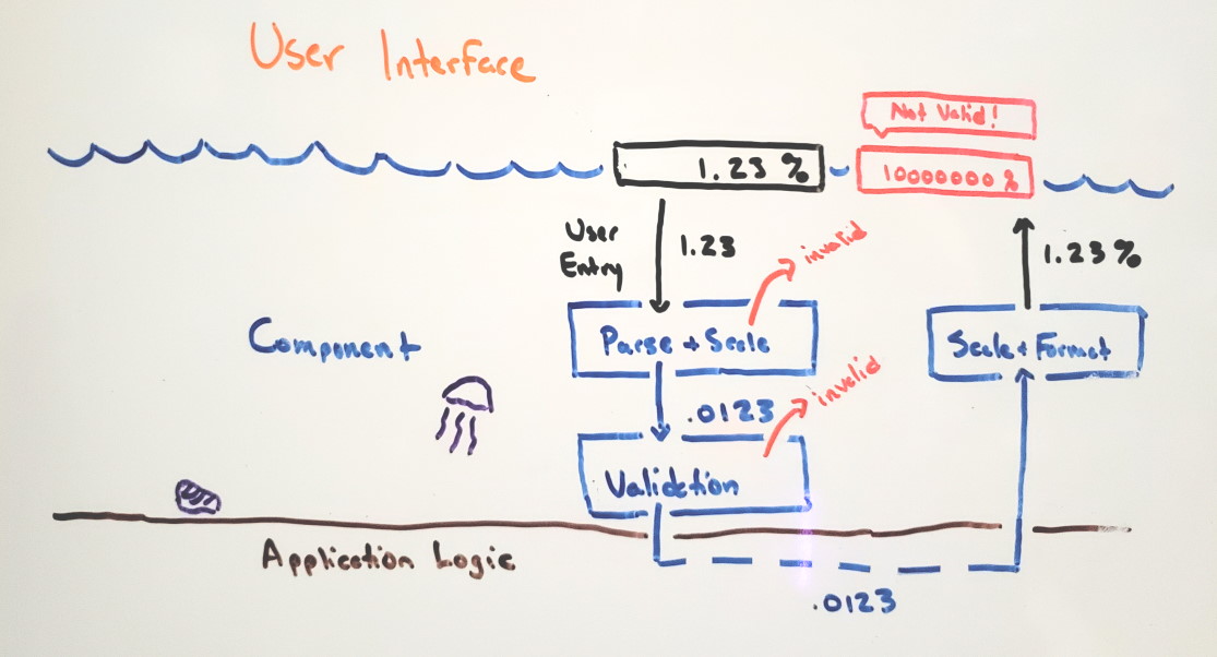
Inputs and data pipeline between UI and back-end models/logic
My preferences are:
- Treat the UI as an API to the user: dirty data can come in, but it doesn't pass through to the business logic
- Capture intended values, not typing: if you intend to enter
$1,234.56, the experience will fee broken if I apply each keypress to downstream calculations and show totals or results for1,12,123, etc. as you type- This one is more important than some developers realize. In a vacuum, updating values for key presses feels fast and interactive and clearly that's a better experience. Except there's a lot of cases where this doesn't match the actual domain, so it actually feels broken and creates doubt about how well we truly understand the customer need.
- Preserve the rest of the screen: if dirty/partial input can't come through, then I don't have to worry about sub-totals going wonky
- Always provide a way back, they should always be able to revert if they start typing in the wrong field
The input pipeline looks like:
- Raw values can be entered, but are only evaluated when the user's intent is captured (full value for current, as they type of text)
- Try to parse the value, proceed no further if the type is invalid
- Scale the raw value from the visual scale to the real underlying value (
$1MMbecomes1000000,10%becomes.1) - Perform validation on the value, proceed no further if the value is invalid
- Apply the update: update the binding or surface an event, depending on your architecture and whether your using mutable reactive props or immutable, event-driven updates
The output pipeline looks like:
- A new value is applied (from input pipeline or prop update)
- Scale the value, (
1000000becomes1,.1becomes10) - Format the value (
1becomes$1MM,10becomes10%)
You can see earlier implementation in a 2016 knockoutjs validation post and the companion post on testing validation.

So let's get to some code.
Coding a Custom Input, Svelte
This is a custom input using Svelte. It is one of several that follow the patterns above.
The broad strokes:
- It is a
CurrencyInputfor US Dollars - This is for US locale, so the formatted value will include comma's for a thousands separator and a period for decimals
- This is USD, there are two decimal places, no more and no less
- The user must fully enter a value, we don't send individual key presses
- Edits from outside (new value received from another user) flow into the control and are displayed, but do not overwrite the value the current user is typing if they are mid-edit
- I could bind to the values, but I have a CRDT event pipeline behind the scenes so I want
updateevents, not direct update of the bound prop - Only re-format when the user is done
- I have built validation in:
- The raw value must be valid before being sent as an
updateevent - There will be minimum and maximum valid values: these also must be formatted for pretty error messages
- When invalid, we lock the focus to the input (using a 1ms delayed focus due to browser event handling differences)
- The raw value must be valid before being sent as an
Usage looks like this:
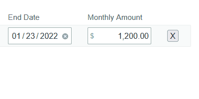
<CurrencyInput
    value={expense.monthlyAmount}
    aria-label="Monthly amount"
    on:change={({ detail }) => {
        expense.monthlyAmount = detail.value;
        recalculateForecast();
    }} />
This is an example, it's been extracted from a much larger project with more polished brand styling and less inline event handling.
Reverting an invalid value and allowing (and correcting) currency signs and separators
Clearly tab and typing works as you would expect, and the temporarily styled validation error pops up with formatted validation values and the underlying valid value. Escape works as expected to reset to last valid value. While I'm typing a new value in, it shows the symbols I'm typing, even if it has to correct them when I'm done.
The underlying component looks like this:
<script lang="ts">
  import { createEventDispatcher } from "svelte";
  import { getCurrencyHelper } from "./currencyHelper";
  import ValidationPopup from "./ValidationPopup.svelte";

  // inputs
  export let disabled: boolean = false;
  export let min: number = 0;
  export let max: number = 100000000;
  export let id: string | undefined = undefined;
  export let value: number = 0.0;
  const ariaLabel: string | null = $$props["aria-label"];

  // -- prep for currency operations
  const locale = "en-US";
  const currency = "USD";
  const decimalScale = 2;
  const helper = getCurrencyHelper(locale, currency, decimalScale);
  // --

  // outgoing events
  const DEBOUNCE_LIMIT = 100; // ms
  const dispatch = createEventDispatcher();

  // validation + format methods
  function validateValue(parsedValue: number) {
    return !isNaN(parsedValue) && parsedValue >= min && parsedValue <= max;
  }

  function formatValue(value: number) {
    return helper.formatValue(value).replace("$", "");
  }

  // manage 3 values: the bound prop `value`, the validated `internalValue`,
  //                  the formatted `visibleValue`
  let internalValue = value;
  let visibleValue = formatValue(value);
  //  - separating value from internalValue helps us detect incoming updates
  $: {
    if (internalValue !== value) {
      internalValue = value;
      visibleValue = formatValue(value);
    }
  }

  // prep for validation
  let isValid = true;
  let formattedMin = helper.formatValue(min);
  let formattedMax = helper.formatValue(max);

  // user interactions

  // - reset the typed value to the bound prop when they hit "Escape"
  function filterKeyDown(e: KeyboardEvent) {
    if (e.key === "Escape") {
      internalValue = value;
      visibleValue = formatValue(value);
      isValid = validateValue(value);
    } else if (!e.metaKey && !e.ctrlKey && !e.altKey && !helper.allowedCharacters.has(e.key)) {
      // prevent default events for keys that are relevant to this input, but allow
      //    other keys to do what they normally would
      e.preventDefault();
    }
  }

  // - attempt to parse + validate new raw values once they are completely
  //   entered: "blur" event
  function handleFocusOut(e: any) {
    const rawValue = e.target.value;
    const parsedValue = helper.parseValue(rawValue);
    if (!validateValue(parsedValue)) {
      e.stopPropagation();
      isValid = false;
      refocusWithDebounce(e.target);
      visibleValue = e.target.value;
      dispatch("validation", { isValid });
      return;
    }

    // may be unnecessary - if we exclude this it requires full round-trip
    //  from bound value to display fresh formatting
    isValid = true;
    visibleValue = formatValue(parsedValue);
    // forced update in case the underlying values haven't changed, don't rely
    //  on reactive update
    e.target.value = visibleValue;
    dispatch("validation", { isValid });
    if (parsedValue != value) {
      dispatch("change", { value: parsedValue, formattedValue: visibleValue });
    }
  }

  let lastFocusTime = 0;
  function refocusWithDebounce(target: any) {
    const time = new Date().getTime();
    if (time - lastFocusTime > DEBOUNCE_LIMIT) {
      lastFocusTime - time;
      setTimeout(() => target.focus(), 1);
    }
  }
</script>

<style lang="scss">
  @import "../../styles/_variables.scss";

  /* ... */
</style>

<div class="gdb-input gdb-faux-input" class:isInvalid={!isValid} class:disabled>
  <span class="gdb-input-symbol">$</span>
  <input
    type="text"
    {id}
    value={visibleValue}
    on:keydown={filterKeyDown}
    on:focusout={handleFocusOut}
    role="textbox"
    {disabled}
    tabIndex={disabled ? -1 : 0}
    aria-label={ariaLabel} />
  <ValidationPopup {isValid}>
    <span slot="message">
      Enter a value between <b>{formattedMin}</b> - <b>{formattedMax}</b>.
    </span>
    <span slot="note">
      or press "Esc" to return to {helper.formatValue(internalValue)}
    </span>
  </ValidationPopup>
</div>
For those not familiar with svelte:
- Any section prefixed with a
$is re-evaluated reactively when a referenced value changes - The HTML section updates reactively to changes to any values referenced
slots are containers that the caller can provide values for (like React/Angular/etc), or default to the values above when not provided (allowing us to create more custom validation messaging in either place as needed)
This doesn't meet the requirements yet, however
Ignoring the temporary styling, there's two additional requirements that aren't met:
- If you and I are typing at the same time, currently your value could replace mine (we need one more value buffer between the raw input value and
internalValue, or an incoming value will update in the input even if you're mid-edit) - Detecting a user done editing:
blur/focusoutis one way, but a timer could also be used to detect a long pause and assume the user is done which might be a better indication the user's intent is complete (or worse, I go back and forth on this)
The last part of this is adding tests (or in this case, it was the first part).
Testing
I'm using Svelte Testing Library, which offers a bonus that the interactions I'm performing at this level also ensure the targeting and readability I want when I test with UI testing tools like Playwright or Selenium.
An individual test is quick and easy to write:
it("Parses and formats a raw entered value that has extra characters", async () => {
    const { getByRole } = render(CurrencyInput);

    const currencyInput = getByRole('textbox') as HTMLInputElement;
    currencyInput.value = "$$1,2,3,4.56";
    await fireEvent.focusOut(currencyInput);
    await fireEvent.blur(currencyInput);

    expect(currencyInput.value).toBe("1,234.56");
});
A downside of this method is I have to know how to fire the appropriate events, but this is still much better than some of the limitations we've had with earlier component testing libraries (like enzyme in React once you started nesting components and wanting to read or interact with those nested components).
Then, on top of this, I run WallabyJS, which means I can quickly write a new test case, see it fail, add the logic, and on we go. I don't TDD all the time, but input and low-level component design tends to be a good place to design with that external API in mind first.
Wrapping Up
My personal opinion is that if data input and manipulation is a core part of your user experience, you should be designing your own input library to make that rock solid. By definition, third party libraries are trying to build for far more generic capabilities, with broader feature sets and more capabilities that you won't need (adding bugs, overhead, and lower prioritization to bugs you need fixed).
I've also found accessibility and testability to be gaps in almost all of them. And if you need a themeable UI, you're probably going to invest in building it yourself anyway.
Each UI library or framework will have it's own peculiarities, and you will have to learn them, but I think it's absolutely worth it. Knowing the ins and outs of input eventing in different browsers is valuable. Knowing how to work with controlled and uncontrolled React components is valuable. Thinking about what that update pipeline needs to be in your application (and not letting a 3rd party component dictate your architecture) leaves you options that can be extremely impactful.